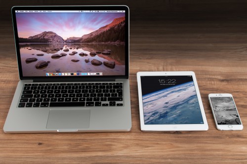
Call (563) 823-1114

Web Design

Lately we have been noticing more and more people are asking us “What is Mobile Compatibility?” or “Can you explain to me what Responsive Design is?” Our answer is always “Yes!” Simply put… Mobile Compatibility is how a person views a web site from a mobile device, such as a smart phone or tablet. While your web site might work just fine on your Desktop or Personal Computer, if you bring it up on a smaller screen, like on your smart phone or tablet it’s a different story. Your potential customer might encounter tiny fonts that they have to zoom in and out on to read, drop down menus that don’t work right, or a flash file no longer supported that won’t work, just to name a few. Responsive Design is a phrase we are all hearing a lot about lately… But

If you follow any of the big blogger/news sites or any tech sites, you've probably seen articles mentioning newer technologies such as HTML5, CSS3 or Webkit.  Adobe Flash is going away, they've stopped releasing updates, iOS and Android Chrome don't even support it, so we're moving in a new direction.  HTML is the language that all basically all web sites/pages are constructed upon, it's the code that explains what is on the page, where it goes, what type of information it is, where to place images, etc.  CSS is a language that accompanies HTML and it tells the web browser how to make the HTML look (what fonts to use, how things are colored, if there are borders, etc).  The latest two languages of these combined give us the ability to make breathtaking web pages that render fast and don't

You may read the phrase "call to action" fairly often on this blog and if already work with us then you know we use that term quite a bit.  But what is "call to action"?  A call to action or CTA, is something that moves a prospect from one step of the sales process to the next.  Here on the web this might be something as simple as a button or a sentence.  All the pages (not blog posts) on this web site have a call to action on them, its a simple sentence at the end of every page telling the person to call us and we give them our phone number. We have found with our sales process that the best thing is for people to call us and then we like to meet in person.  Some businesses may

More and more, mobile devices are starting to dominate.  Smart phones and tablets are quickly becoming the mainstay. In Apple's Q1 earnings call, Macstories.net reports Apple sold 7.33 million iPads and 16.24 million iPhones.  Apple predicts the tablet will soon replace the home computer.   It makes a lot of sense, mobile devices are fun, they are fast and are relatively affordable compared to a computer.  How often do you use a phone or tablet to surf the web?  Its always nice to view a web site that has been optimized specifically for a phone or tablet.  Why wouldn't your web site also have those optimizations and goals? Except for certain circumstances we, as an industry, have been operating under the model that the desktop (or full size) site is primary then mobile is secondary.  Now, with the advent of mobile

Quad Cities Web Design | Iowa Web Design | Quad Cities Mobile App Development | Quad Cities Search Engine Optimization | Quad Cities Social Media Marketing | Davenport Search Engine Optimization | Home Studio Today